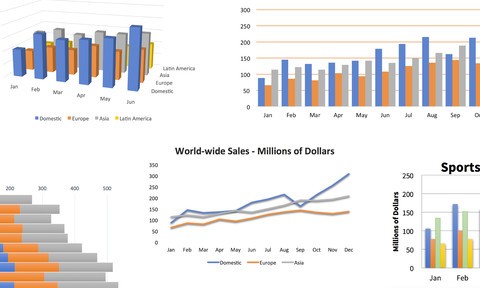
Excel charts allow you to communicate information with much more impact than raw numbers and are surprisingly easy to generate. Instructor Dennis Taylor shows you how to create different kinds of Excel charts, from column, bar, line and pie to more recently introduced types like Treemap, Funnel, and Pareto. He explains what types of data work best with each so you can decide which type to choose for your specific information. Plus, learn how to fine-tune your chart’s color and style; add titles, labels, and legends; insert shapes, pictures, and text boxes; and pull data from multiple sources.
Learn More