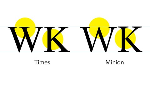
When type is the star of your design, you want to make sure to set it perfectly. Before & After guru John McWade shows us what good type looks like. He walks through choosing the right typeface and styling type—without using the automatic settings on which many designers rely. Instead, he counsels us to really see type and then adjust the letterforms so they are balanced and beautiful.
Along the way, he touches on points small and large: indents, sizing, spacing, line length, punctuation, and the main differences between setting text for screen versus print.
Learn More

