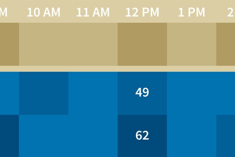
You don’t need special software to create data visualizations. With some advanced functions, formatting, and filters, you can create these heat maps right in Microsoft Excel. The techniques shown in this course transform Excel from a basic spreadsheet program into a dynamic and powerful analytics tool for heat mapping.
Chris Dutton provides hands-on examples designed to showcase why certain functions—DATEVALUE, VLOOKUP, COUNTIF, and more—are so valuable to mapping data. He also shows how to use conditional color-scale formatting to map your data matrix, and find different ways to examine the same data with different criteria, using dynamic filters. The course wraps up with a few finishing touches to make your heat map even more useful and engaging, including a preview of what’s possible with the Power Map addin.
Learn More

